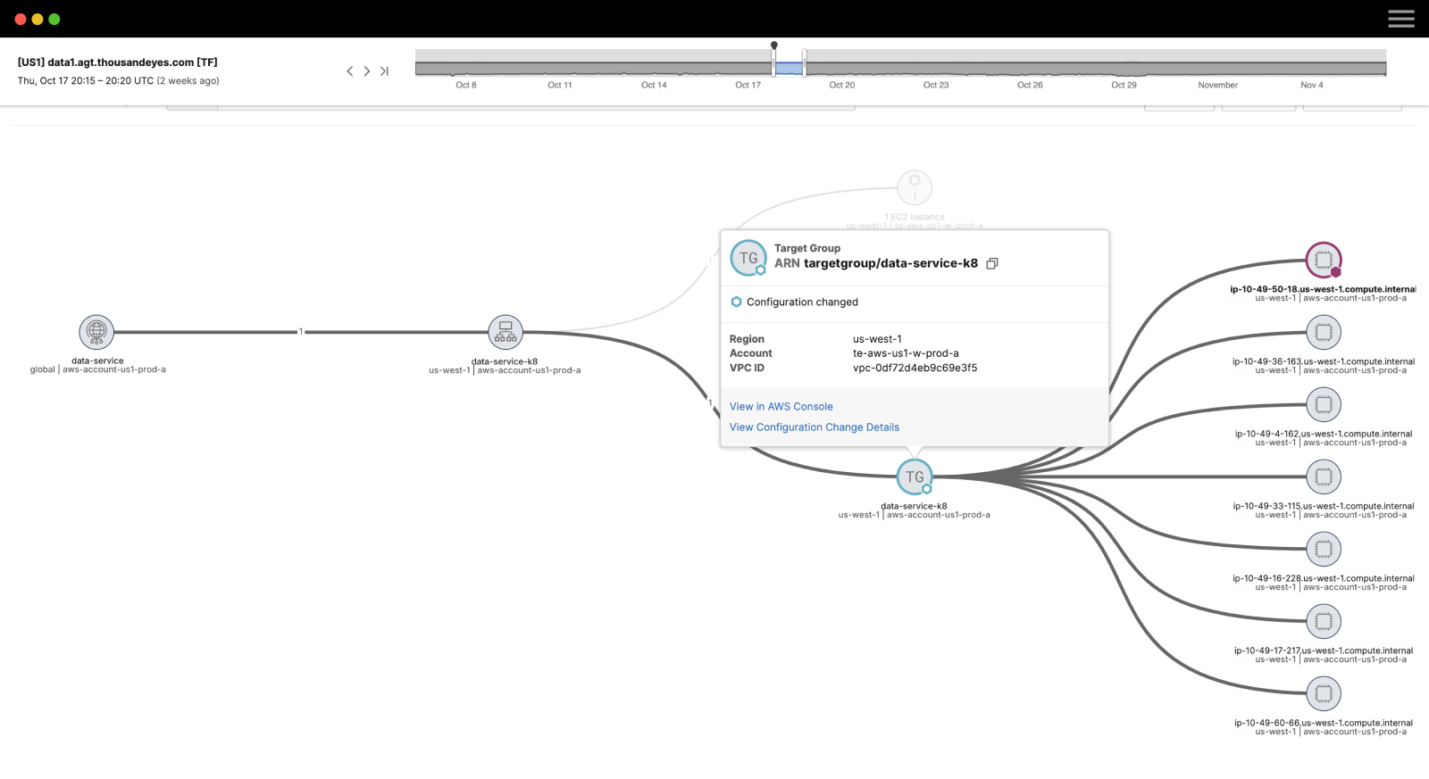
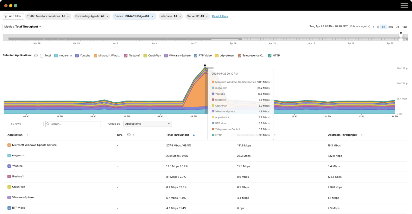
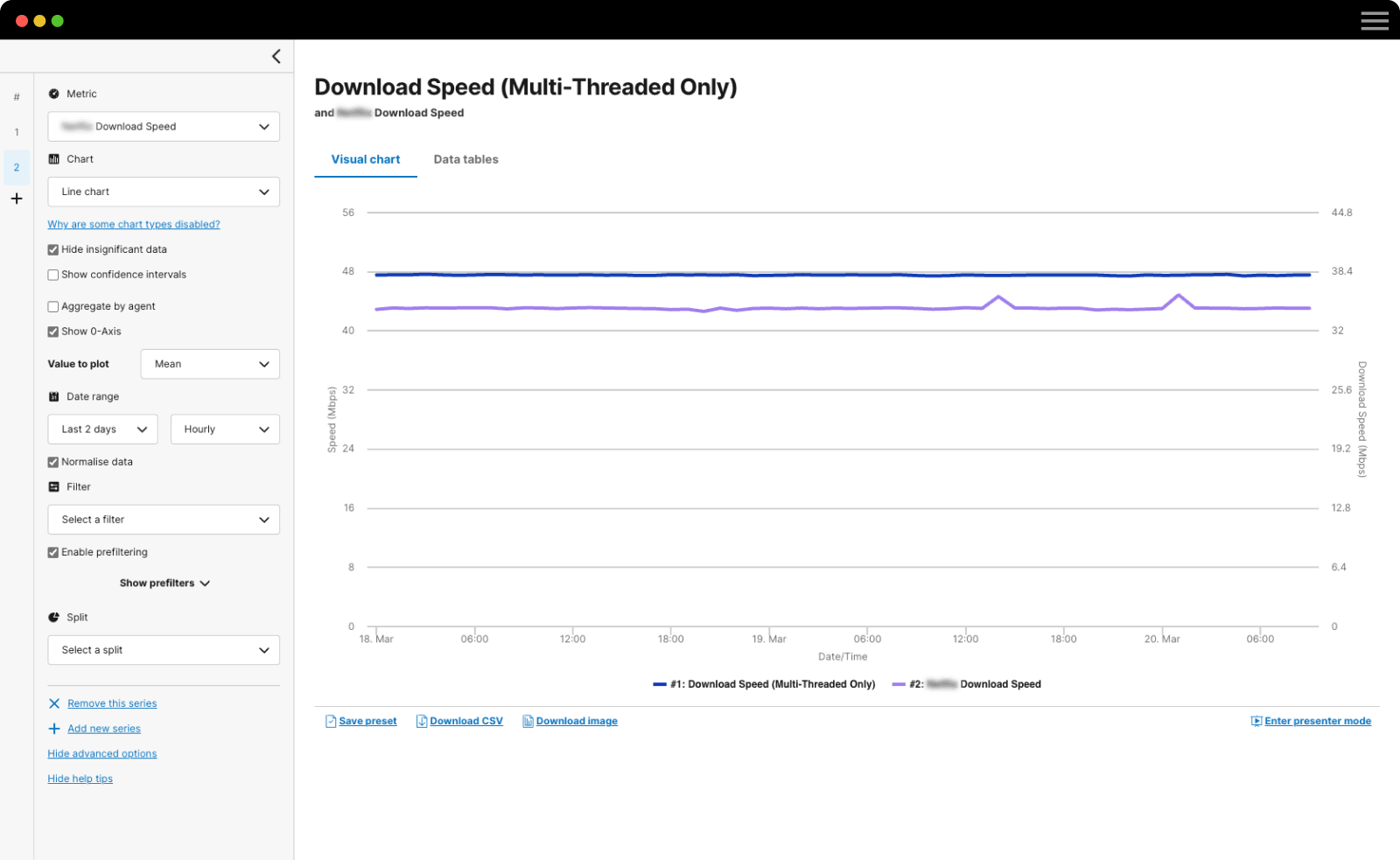
Our latest release, on July 7th, features some exciting new UI/UX enhancements and features. In addition to streamlined navigation, we’ve made the views more responsive with auto-refresh and added new filters so you can quickly find the data you want.
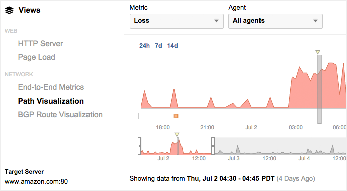
Our primary goal was to improve the user experience of the main views within the product by unifying them in a single interface. By doing this, the views now reload only the data necessary and fetch new data as soon its available. The experience is snappier, the data is fresh and it’s easier to navigate around various metrics and layers. In addition, we moved the menu and settings to make the options more prominent and easily accessible.
Over the past year, we’ve rebuilt the application front end using AngularJS. You’ll have noticed this in the Reports that we introduced earlier this year. Now we’re putting that architecture to use; the presentation layer is more flexible, making it faster for us to make further improvements. You can expect more exciting visual elements in the coming months.
Top Six Improvements
Here are the highlights from the release that you’ll likely notice right away:
- Menu Navigation: We redesigned the menus, from the top to the left, to better support a variety of devices and slim down the number of choices. You’ll find account settings, notifications and help prominently displayed at the top.
- Contextual Navigation: We replaced the Jump To menu with a set of contextual links that will move between Views while maintaining the same test, time and agent selections.
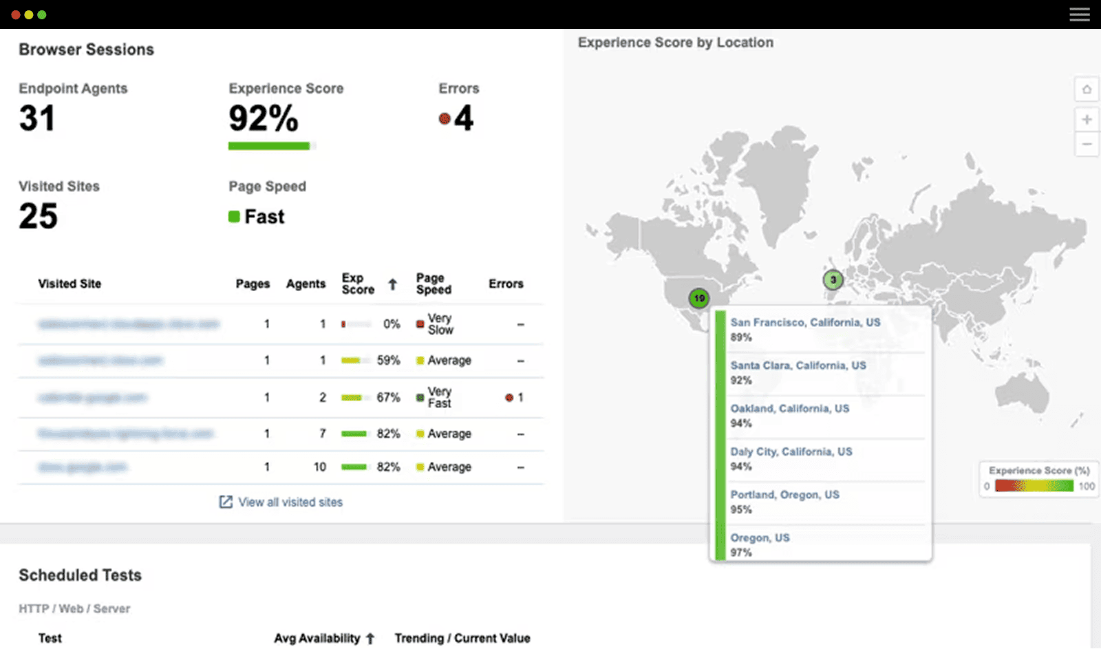
- Responsive Views: The Dashboard and Reports are now responsive for screens larger than 1000 pixels, so they look beautiful on large monitors or screens in your NOC.
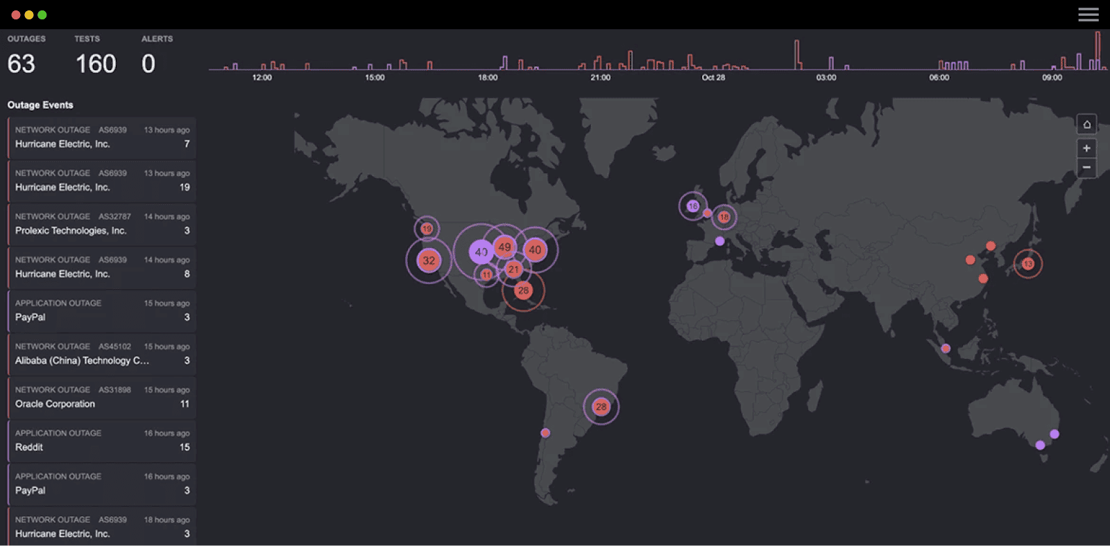
- Auto-Refresh: The Dashboard and Views now refresh every 2 minutes as new data is collected and moving between Views reloads only necessary elements.
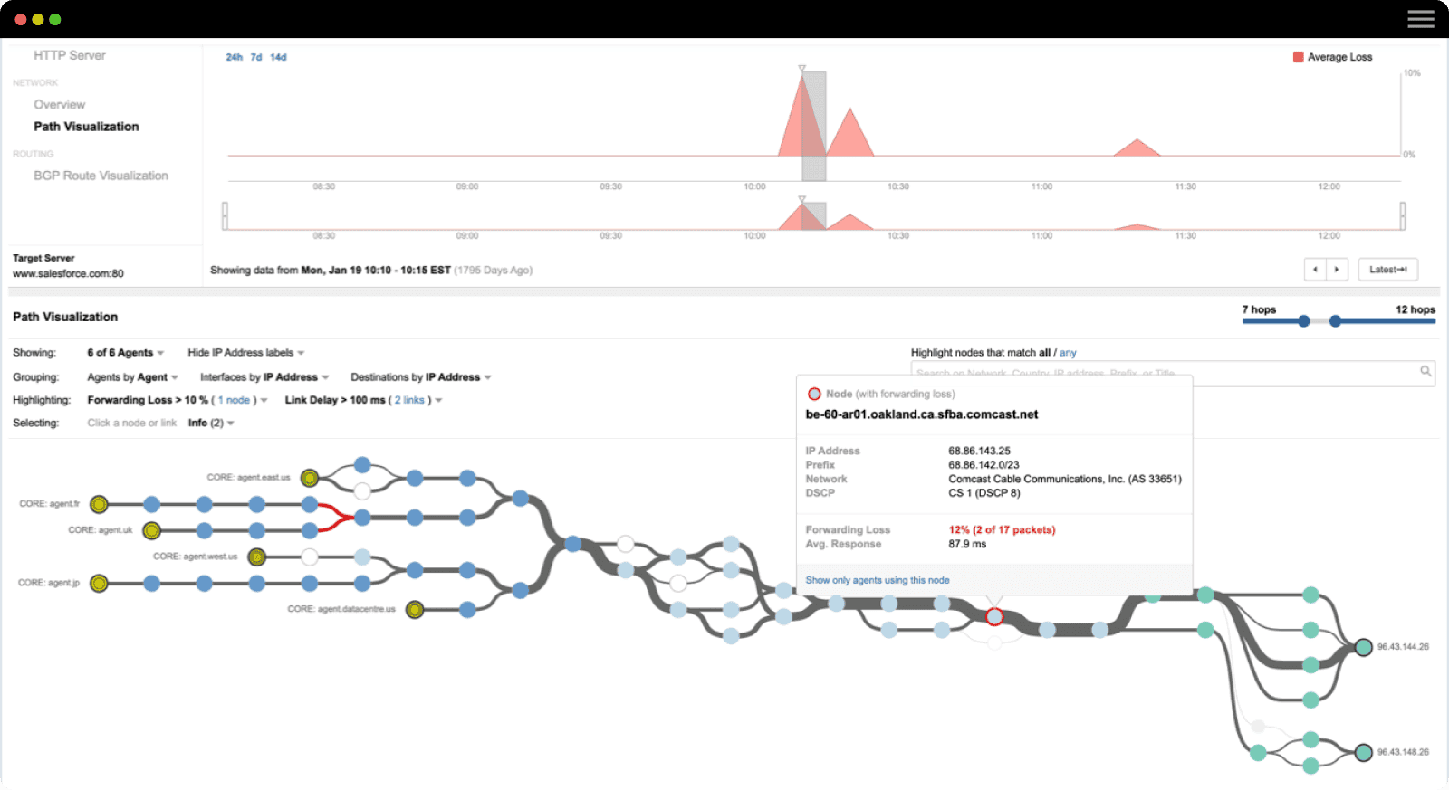
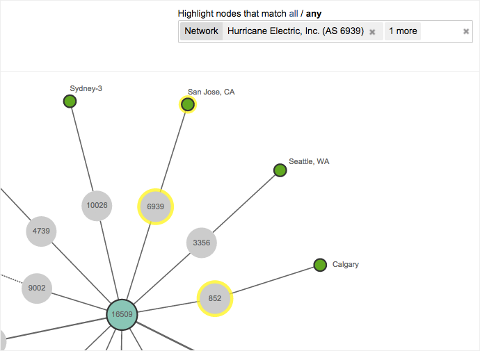
- Selectors and Search Bar: We improved selectors and added a new search bar for Path Visualization and BGP Route Visualization, so you can easily see all high latency links or filter by specific ASNs.
- Touch experience: If you’re using a touch-based computer or mobile device, it’s easier to navigate and use the platform.
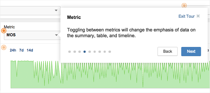
Have questions on how to use the new UI? Check out the question mark at the top right of the application to access Customer Success Center documentation, Page Guides or Live Chat with our team.
