Updated on June 14, 2016 with the new box and whiskers widget.
So you have plenty of tests running that have gathered a lot of useful information — but how do you summarize up to 90 days’ worth of data in a meaningful way? In this post, we’ll talk about using ThousandEyes report widgets to discover and convey data trends and summaries effectively. We’ll also go over how to share, save and schedule these reports.
Choosing the Best Widget for Your Data
How you visualize your data is very important for distilling and communicating a message to your audience. A report consists of one or more configurable report widgets, with each widget representing a different visualization, chart or table. Report widgets can be used for a variety of purposes, including exploring trends in the aggregate, creating visualizations for a presentation, and generating summary statistics to get quick updates. You can use filters in each widget to see exactly the data that you want—include or exclude particular tests or agents, or include entire groups of tests or agents to see the data in the aggregate.
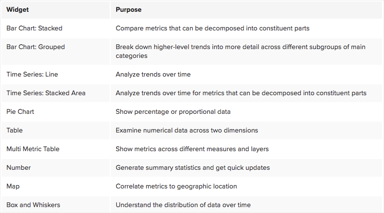
There are currently ten types of widgets available. See the table below for a summary of these widgets and what they’re generally used for.
Let’s jump into some examples of effectively using these report widgets to visualize data collected from Agent-to-Server, HTTP Server and Page Load tests to Twitter. Feel free to explore the examples presented in this post by viewing our report snapshot at this public link.
Stacked bar charts are used with metrics that can be further broken down into constituent parts: total error count, response time and total fetch time. Total error count is composed of the various types of errors that agents encountered; response time and total fetch time are composed of the various amounts of time spent in their constituent phases. You can look at these decomposed metrics across tests, servers and geographic locations.
This stacked bar chart shows the median of total fetch time broken into its components and separated by agent. We use median here because the Taipei agent has outliers that significantly skew the mean.
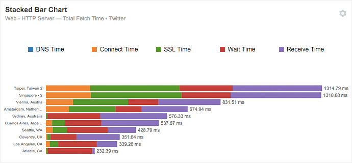
We can again quickly single out the worst performers in terms of total fetch time: the Singapore and Taipei agents. As another example, the Atlanta agent observes an unusually long wait time that also warrants further investigation. Stacked bars give you a more granular view, allowing you to better locate potential issues.
Grouped bar charts are a way of visualizing information about different subgroups of main categories. Grouping adds the ability to break down a higher-level trend into more detail across subgroups.
This grouped bar chart shows mean latency broken out by continent for each test.
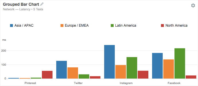
Charts like these allow for easy comparison among similar competitors. For example, we see that Instagram and Facebook are the underperformers in terms of latency across most of the continents we collected data from. And surprisingly, Pinterest’s worst-performing continent is North America—an observation that should prompt further examination.
Line (time series) charts are useful for examining trends in key metrics over time. You can compare metrics among tests, servers, agents, countries and continents to understand longer-term differences and trends among services and geographic locations.
The below example plots the 98th percentile of page load time over time for Twitter, broken out by continent. Using the 98th percentile measure, we can start to understand the outliers in this particular data set of 7 days—in other words, what page load time looks like when it is severely underperforming. The 98th percentile measure is more stable over time than measures like mean and standard deviation because unlike these measures, 98th percentile disregards extreme outliers and can thus be a good basis for comparison across groups.
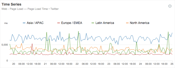
Here, we see that the Asia/APAC region consistently observes page load times significantly higher than other regions, where the 98th percentile measure sits at levels around 5 to 8 seconds. Time series charts like this one are helpful for revealing trends across time, services and geography.
Stacked area (time series) charts, like line charts, are also used to examine trends in metrics over time—the distinction is that the metric used can be decomposed into its constituents to show part-to-whole comparisons and how they change over time. Relevant metrics include response time, total fetch time and total error count.
In the chart below, we see mean response time over time for Twitter broken down into DNS time, connect time, SSL time and wait time. The slice for DNS time is not visible because it’s so small, ranging between 0.3 and 0.4 ms, so it’s an almost negligible portion of response time as a whole. At 21:00 PST we see a spike in connect time, SSL time and wait time. Due to increases in all of these components, total response time spiked to more than 600 ms, perhaps caused by congestion at the server.
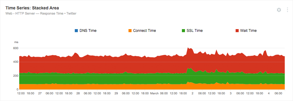
Though the percentages taken up by each component in this example stayed more or less the same, sometimes changes in these proportions occur in telling ways. For instance, if DNS time has a significant spike but no other components see changes, it’s obvious that something is wrong with the DNS resolution process.
Pie charts are used to show percentage or proportional data to convey the size of the “slice” of the pie that each component makes up.
Here, mean response time is broken into its component phases for each continent.
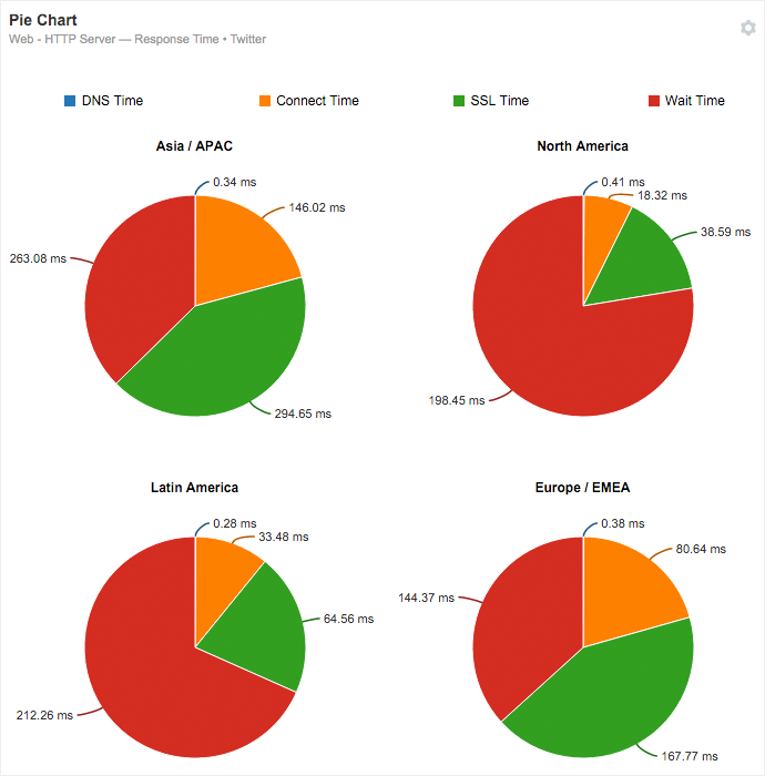
From this chart we can see that in North America and Latin America, wait time makes up a much greater proportion of response time than that of other continents. This inspires some interesting questions—why do these percentages differ so much across locations? What should these pie charts ideally look like, and how do we get there?
Tables are great for viewing numerical data across two dimensions. The first dimension (along the rows) is usually by test; the second dimension (along the columns) is usually geographic location—by agent, country or continent.
This table shows the mean of packet loss broken out by test and continent in two dimensions, with the difference between measures for the current and previous data sets shown in red and green, depending on the sign.
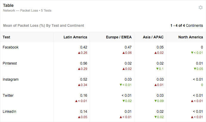
We can immediately see that compared to the last week, packet loss in tests from agents in Latin America has seen a substantial increase for most services, so there may be network issues in this region that should be investigated. In addition, we can compare performance across similar services and identify LinkedIn and Twitter as the best performers in terms of packet loss.
Multi metric tables show multiple metrics for a given list of tests, servers or geographic locations. This widget can help you simplify reporting and optimize space in a report.
For instance, you can see a single metric like packet loss across different measures including minimum, mean, maximum and standard deviation. Alternatively, you can assemble metrics from a number of different layers, as below.
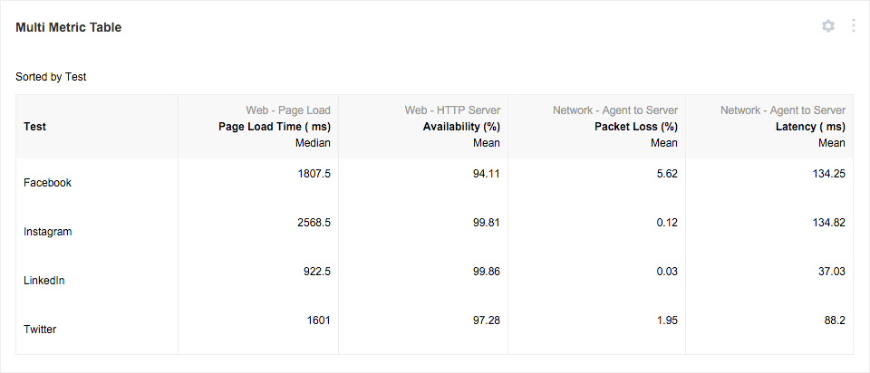
Above, we can see how several social media sites are faring across different layers, like Page Load, HTTP Server and Agent-to-Server. We see that Facebook does the worst in terms of availability (94.1%) and packet loss (5.6%), though Instagram is perhaps worryingly on par with Facebook’s relatively high latency of around 134 ms. With multi metric tables, you’ll be able to get a comprehensive, high-level picture of how your applications and networks are performing in a single table.
Number visualizations are useful for to-the-point updates on the metrics most important to you. Customize them to generate summary statistics for quick checkups to make sure everything is humming along.
This number chart gives a quick rundown on key metrics from HTTP Server and Agent-to-Server tests: availability, total error count, latency and packet loss. Note that we used the 98th percentile measure for latency in order to understand the worst performers in the data set.
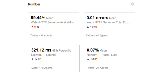
Here, we see that compared to last week’s data, there have been negative trends in both the HTTP Server and Network test metrics. Charts like these allow you to get an idea of how your monitored services are doing with just a quick glance.
Maps are another way to correlate key metrics to geography, in addition to the option to group or filter by geographic location in all other widgets. A map widget plots data aggregated by city, country or continent to the location where it was collected. Maps are easily digestible — with just a quick glance, you can start to understand performance trends across geographic locations.
The below map shows mean latency to Twitter aggregated by continent. To ensure that data from your Enterprise Agents is also plotted accurately, verify that their locations are correct on the Enterprise Agents page under the Settings sidebar.
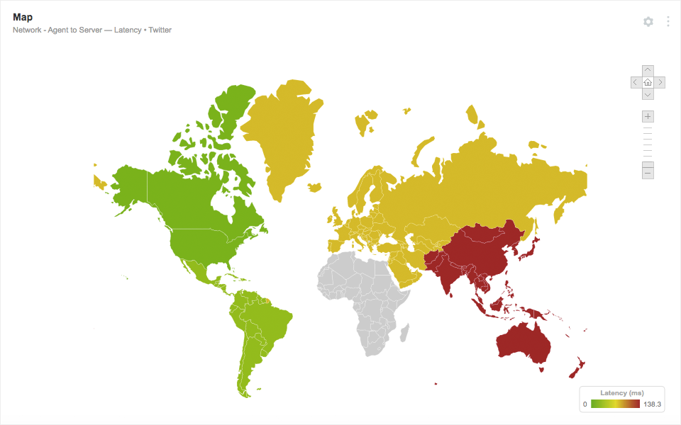
From this map, we can very quickly see the correlation between latency and distance to the destination. North America is seeing a mean latency of 15 ms, while Asia has a latency of 143 ms. Because the target of the test is located in San Francisco, it’s clear that the farther you get from North America, the higher mean latency generally is. Metrics can also be aggregated by city or country for more granularity.
Box and whiskers charts are great for visualizing a large amount of information about the distribution of a given metric in a single chart. The top and bottom edges of the “box” denote the third and first quartiles, respectively, with the dot in between showing the median value. The top and bottom “whiskers” represent the maximum and minimum, respectively. With five values for each time period, one box and whiskers chart displays the same amount of information as five line charts, in a format that makes it easier to spot and understand trends.
The below box and whiskers chart shows page load time to Twitter for the Asia/APAC and Europe/EMEA regions.
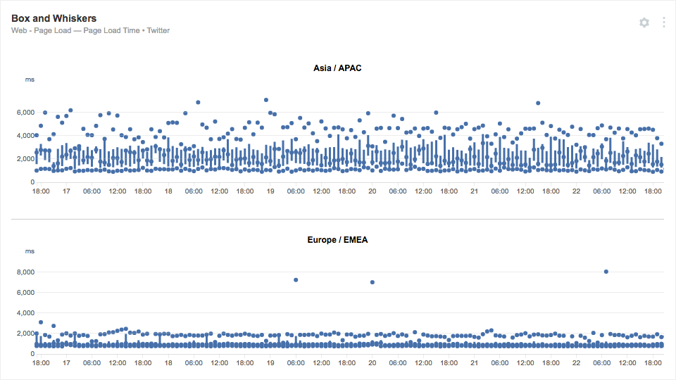
The difference between these two graphs is stark: while the Asia/APAC region sees a wide variety of data samples for page load time ranging from around 1,000 to 6,000 ms, the distribution for the Europe/EMEA region is much more narrow, likely indicative of greater proximity to the test target and a more developed and reliable network infrastructure.
Choosing a Measure
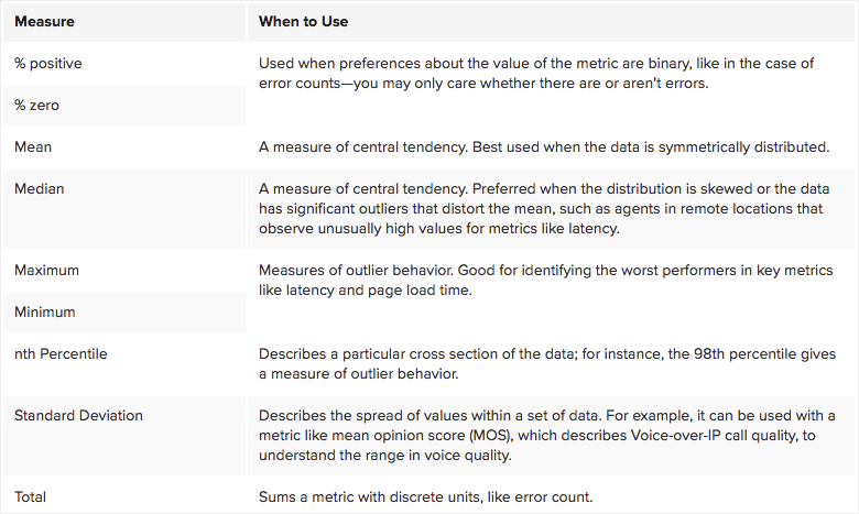
When setting up reports, you’ll need to designate the measure for the metric you choose. In other words, what slice of your data are you most interested in seeing? You’ll need to choose your measure wisely to meet your specific use case. See the table below for a quick rundown of when to use which measure.
Once you have some great reports set up, you won’t have to reinvent the wheel every time. Replicate widgets within your report by clicking the ‘Duplicate’ icon on the widget you want to copy. Duplicate reports by clicking ‘New from this Report’ under the ‘Reports’ dropdown. You can also set a report to be a user or account group default report to display it in multiple accounts and ensure consistency in layouts.
Saving, Sharing and Scheduling
To save your report for future use, select ‘Save a Snapshot’ under the ‘Snapshots’ tab at the top of the page.
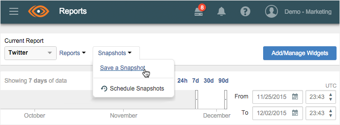
Once your snapshot is saved, you can view it in ‘Report Snapshots’ under the ‘Reports’ subheader. You’ll also be able to share it through a public link that can be accessed by anyone, just like we've shared the examples from this post at this public link.
At the top of your report, there is also an option to schedule snapshots. You can choose the amount of data, start date, end date and frequency of snapshots, and you also have the option to email snapshot notifications to a designated list of subscribers.
Saving snapshots can be especially helpful for recording the “before” and “after” states of significant events, including infrastructure changes, routing changes, CDN changes and outages.
Finding Meaning in the Aggregate
Once you get the hang of creating reports from the data you’ve collected, you’ll start to see correlations in large data sets. Aggregating data in this way is extremely helpful for discovering macro-level trends and can ultimately help network teams understand the big picture and proactively address potential issues.
