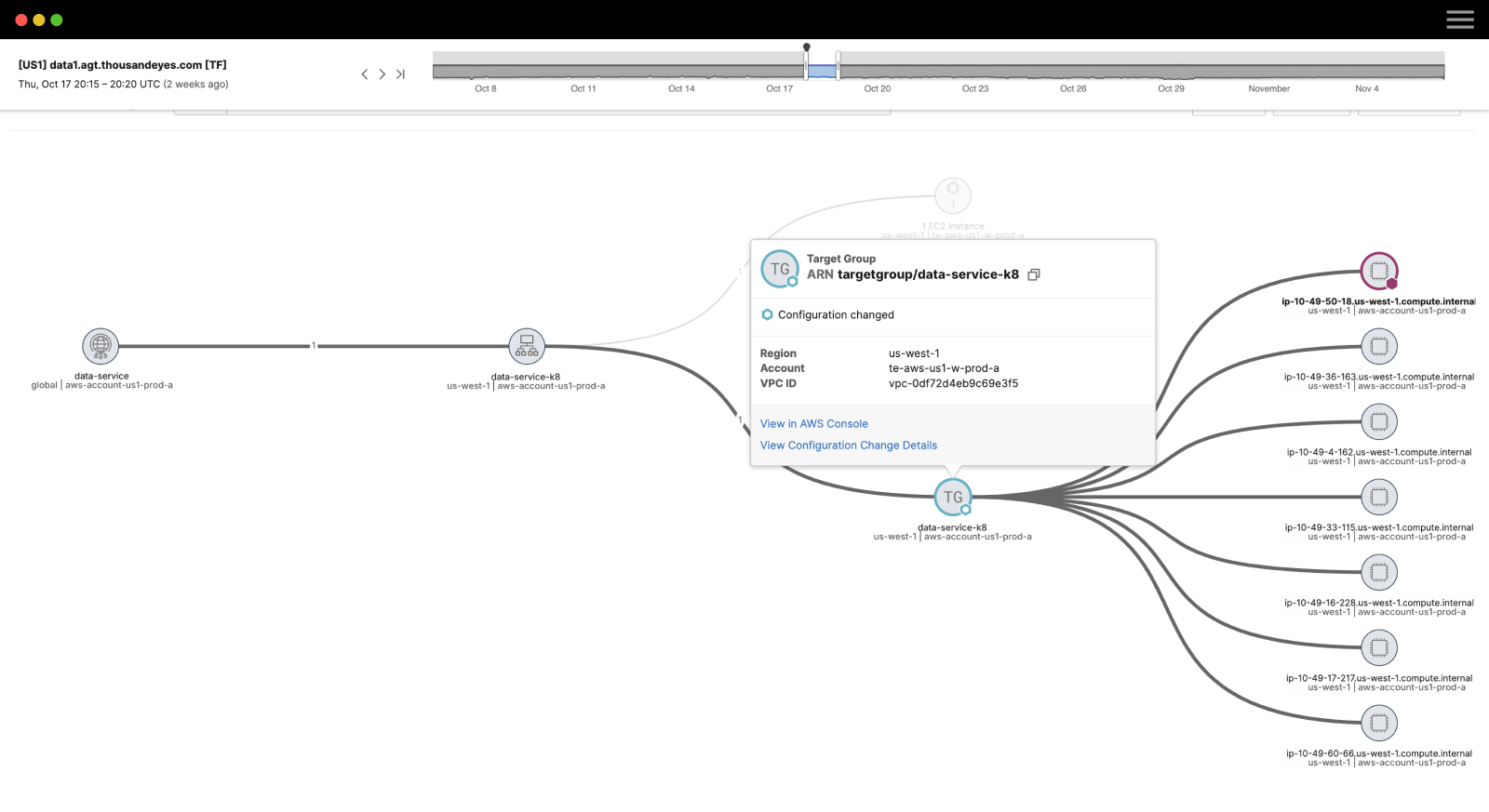
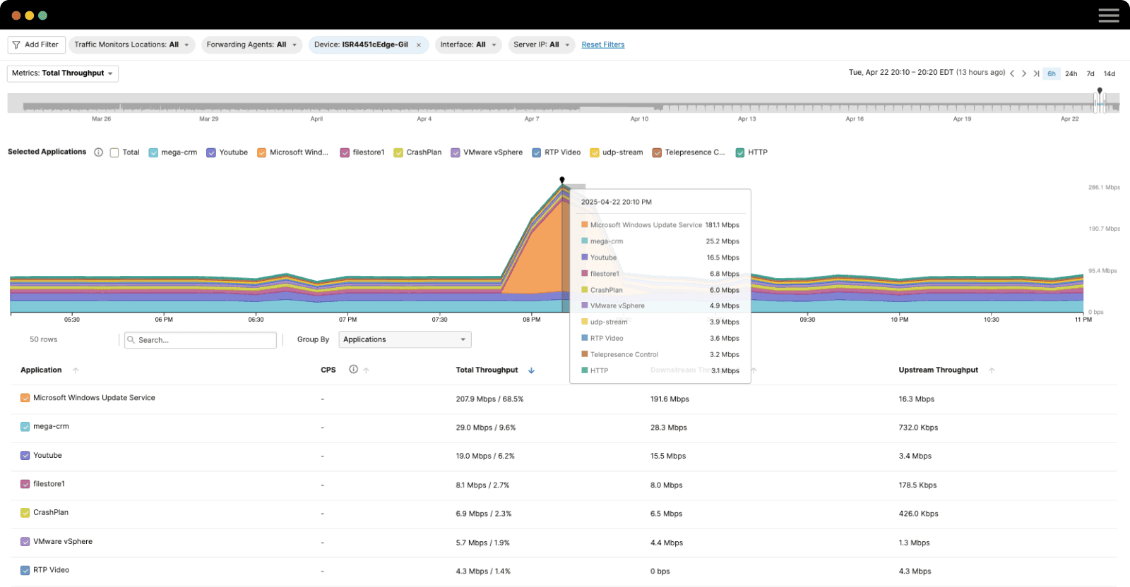
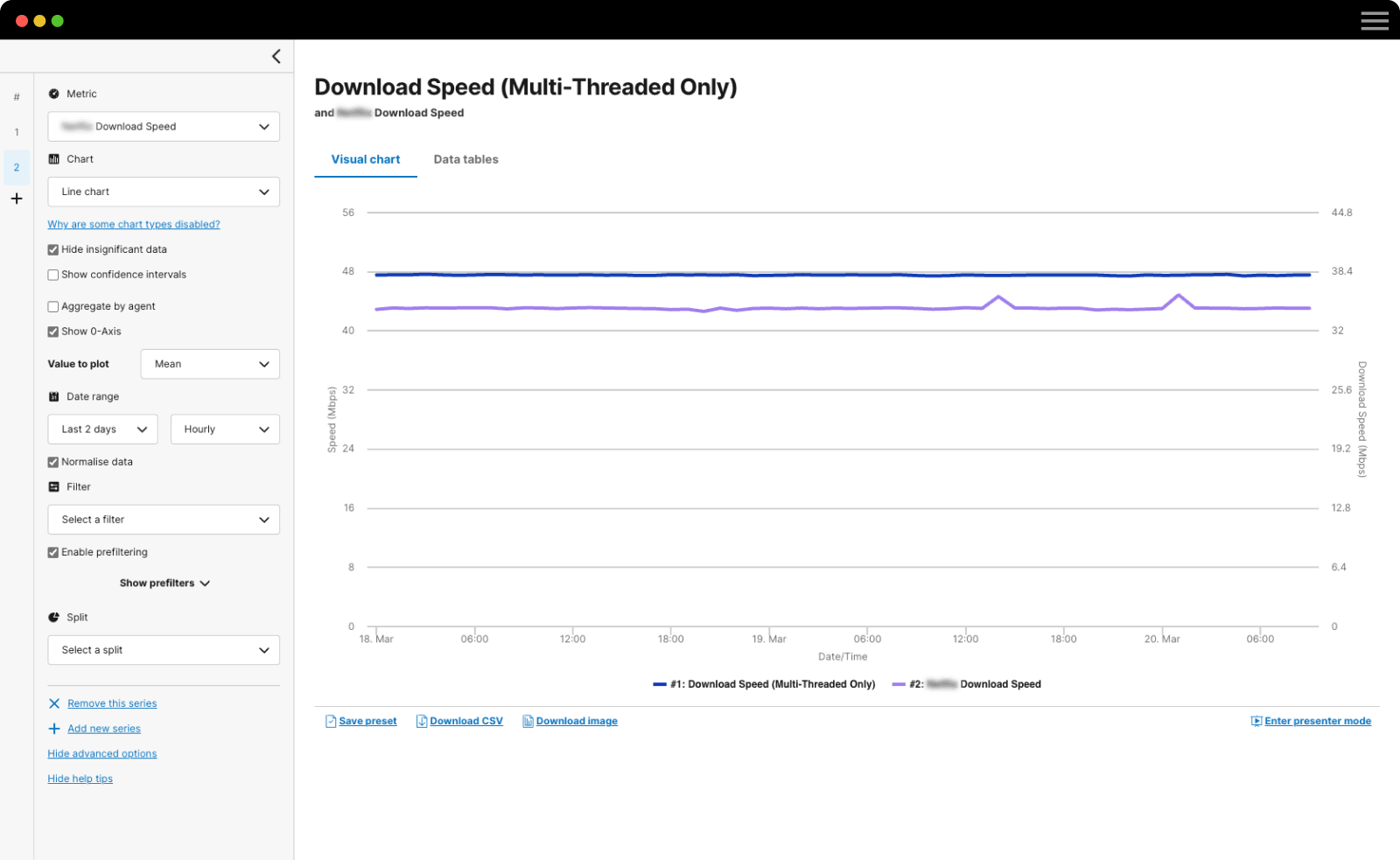
ThousandEyes reports have seen dramatic updates in the past few months—not only have a number of new data visualizations been introduced, but the ways in which insights from reports can be shared have also expanded to embedding report widgets. We’ve recently updated Using Analytics Reports to Present New Insights to show how to use all of the report widgets and measures to your advantage. In this post, we’ll look at how embedded widgets can be used to improve how your team, customers and providers view your data.
Embedding Widgets
An embedded widget is a link to a report widget that you can use in the HTML source code of any web page. It looks and behaves in the same way as the original report widget, and the content of the embedded widgets will automatically update as new data becomes available.
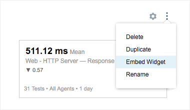
To embed report widgets, select the embed option on the upper right corner of the widget. Specify the amount of time to be shown in the widget and copy and paste the provided HTML code that embeds the widget as an iframe, which will dynamically resize to fit its container. For more information on the technicalities of embedding a report widget, see the Knowledge Base article, Embedding Report Widgets in External Websites.
Embedding widgets expands your ability to display real-time data for a number of key purposes, including custom dashboards, status pages and internal analysis. In this post, we’ll use data from tests to a limited group of Salesforce endpoints in North America to show how versatile embedded widgets can be.
Custom Dashboards
One of the most obvious uses of embedded widgets is to create a custom dashboard that displays key up-to-the-minute metrics. This dashboard can be displayed on a large presentation-style screen in a network operations center (NOC), for example, so that your team is abreast of network and application issues as they occur.
As an example, see below for a few report widgets that might be part of a dashboard. The first visualization is a ‘number’ widget showing key application and network metrics like availability and latency for a group of Salesforce endpoints. The second is a line graph showing mean packet loss over time to the same endpoints, grouped by the monitoring agent.
Together, a number of well-crafted widgets can make up a valuable dashboard that keeps its viewers informed about the state of relevant services. To conserve screen real estate, you could even create a carousel that iterates through widgets for a variety of metrics and services.
Status Pages
Embedded widgets can also be used to display report data relevant to those outside your organization. Widgets on an external web page can help you better sync and collaborate with your providers, and can also help communicate real-time performance to your customers.
For example, you can create a status page for your own service to keep users informed of how your service is doing and whether there are any issues. The below ‘number’ widget shows recent performance metrics that customers care about and can understand with just a quick glance—availability over the last 30 days, and availability and response time over the last 24 hours. The difference in the given metric between this time period and the last is also shown.
Internal Analysis
Finally, you can use embedded widgets to bring data from the ThousandEyes platform onto internal sites like wikis. This way, you and your team can conduct in-depth analysis internally by annotating ongoing trends, exploring aggregate data and benchmarking similar services.
The below stacked bar chart shows median fetch time to the Salesforce endpoints, grouped by agent. International locations like Singapore, New Delhi and Hong Kong have high fetch times while North American locations see low fetch times, which comes as no surprise since the test targets are all in North America.
Report widgets also make it easy to compare performance across services, servers and geographic location. The below multi-metric table benchmarks several commonly used SaaS services on key metrics like availability, packet loss, response time and latency. Similar to the ‘number’ widget, the difference with the last time period is also shown for each table entry.
By bringing data-rich visualizations like these widgets onto internal platforms, you and your team can better collaborate on and document the analysis and decision making involved in improving your service’s performance.
Sharing Data Optimally
The flexibility offered by widget-based reports can now be extended to data presented outside the ThousandEyes platform. With embedded widgets, you can now very quickly visualize the exact slice of data you want and present it in the framework of your choice. Together with sharing, saving and scheduling options for reports, embedded widgets have further empowered teams to document and share their data, far beyond simply downloading and emailing PDFs of reports. With a wealth of visualization and sharing options, you can ensure that the data you collect is used to its full potential. Sign up for a free trial of ThousandEyes to start using reports to uncover and share insights from your data.
