Hope the Fall season is treating you all well. We are really excited to give you some colorful updates to get you better insights into your applications, and networks. Without more ado, here is all the exciting stuff we have come up with since August:
- Endpoint Agents can now monitor non-browser-based workloads using scheduled testing capabilities and can help troubleshoot wireless issues.
- Dashboards celebrate the fall season with a brand new color-coded widget style called the Color Grid to denote overview and status of applications.
- Instant tests and test snapshots can now be triggered via the API to help automate testing workflows.
- BGP gets a visual makeover to easily focus on routing and reachability problems.
Keep scrolling to learn more about these features and how you can incorporate them into your environment.
What’s up with Endpoint Agents?
In the past few weeks, we have added a number of new capabilities to our endpoint agents to support a broader set of use cases and workflows.
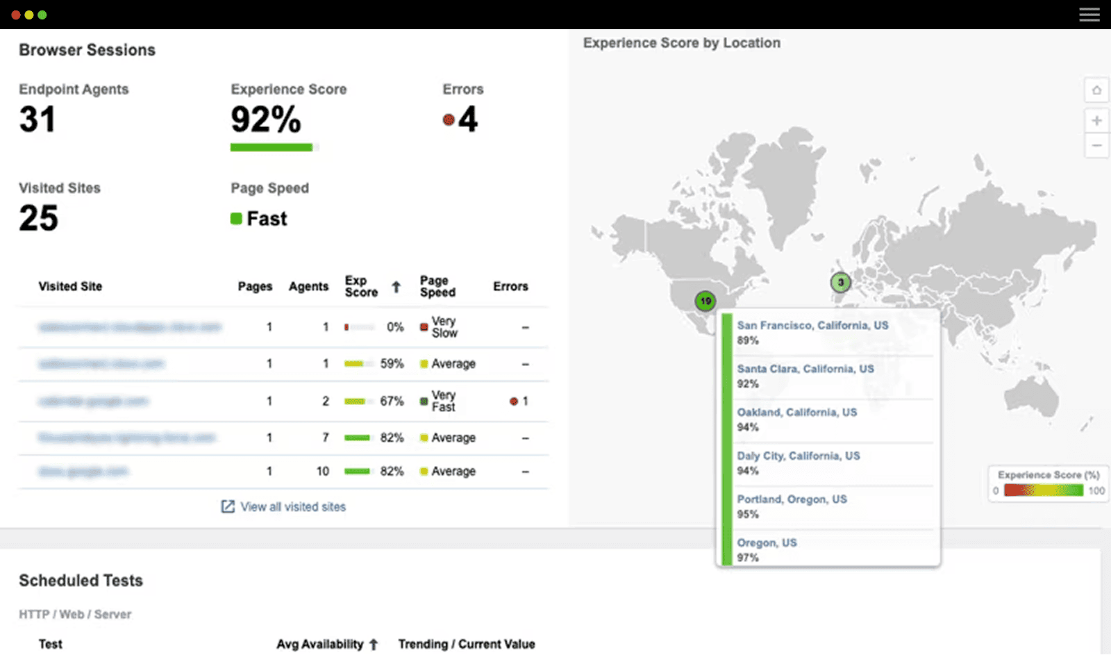
You can now run scheduled tests from our Endpoint Agents to non-browser-based targets or server endpoints in addition to monitoring browser session data. Each Endpoint Agent can run up to three HTTP Server or Agent to Server tests to target specific server endpoints. As shown in Figure 1, the endpoint agents can provide you with a continuous baseline of performance for both browser and non-browser applications from each of your end users.

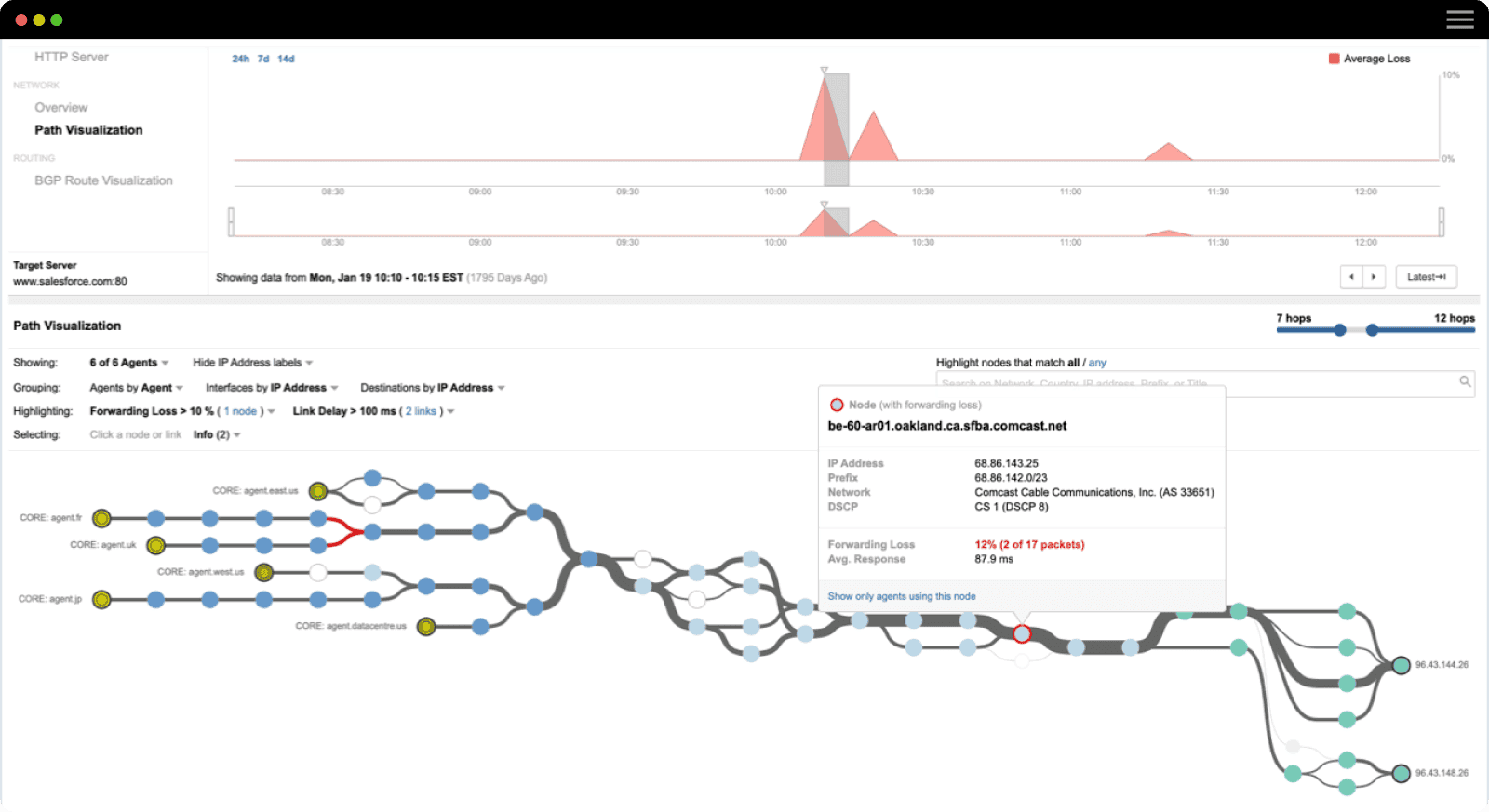
Each layer of data provides an aggregate view from all the Endpoint Agents, which can then be filtered by various criteria like the targeted domain, agent name or agent geography. In the network layer, you can also examine the Path Visualization which describes the path taken by traffic from the Endpoint Agents to the destination endpoint through the internal and external networks. As seen in Figure 2, the agents are clustered based on the network that they belong to, and you can focus and drill down to the part of the network that might be causing the decline in performance.
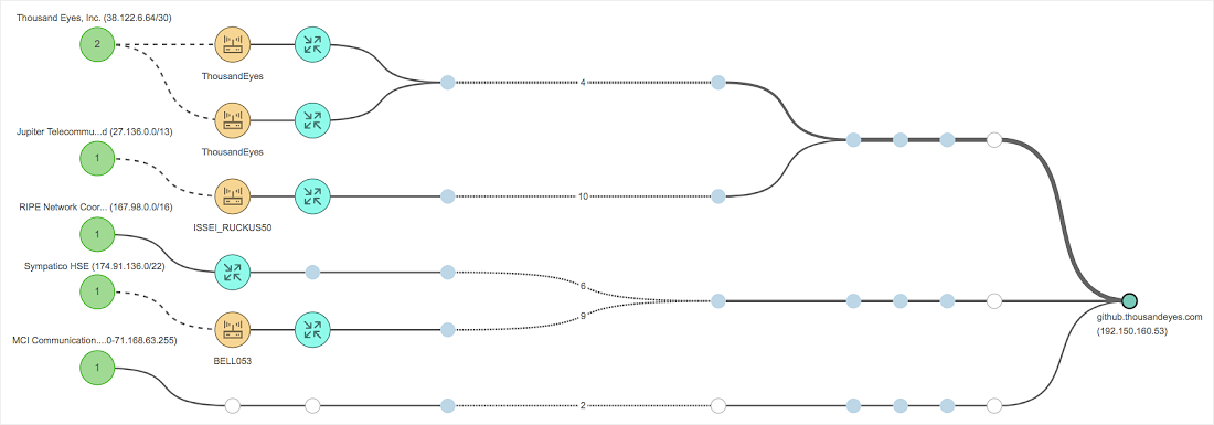
The insights from scheduled testing are further enriched by the network topology and wireless views where you can correlate the information from internet hops with the performance of your internal network.
You can assign a set of default or custom alert definitions to these tests similar to testing with enterprise or cloud agents, and you can push these alerts directly into your ServiceNow instance through our native integration with ServiceNow.
Finally, we have also added these metrics to our Reports and Dashboards. You can create customized reports to engage with a larger audience.
How to spot a bad Access Point (AP)?
You have a company all-hands, but your employees in the Penang office can’t really stream it. You realize that your streaming application is working fine, but your remote employees still can’t see the live stream. Maybe is an issue isolated to the AP within the Penang office? But, how can you be sure?
You can use ThousandEyes Endpoint Agents’ new wireless monitoring capabilities to determine whether it’s the access points in your Penang branch that are causing the issue.
You can get two perspectives, one from the Endpoint Agent and the other from the AP (denoted by BSSID) that it is connected to.
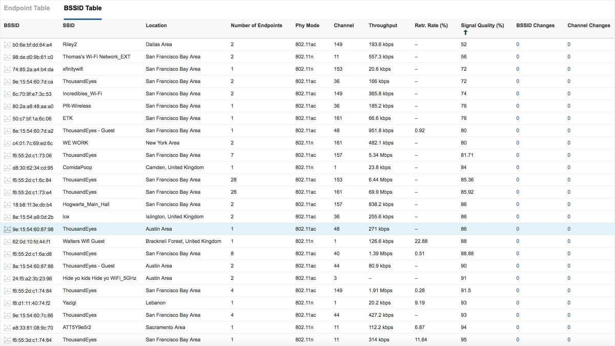
As shown in Figure 3, you can get an overview of the characteristics and performance of a particular BSSID that your endpoint agents are connected to. You can get a good sense of the signal strength and the corresponding noise in the channel by evaluating the signal quality. You can then compare that with the aggregate throughput (which the amount of data flowing through the AP in a given time period), and BSSID changes or retransmission rates to evaluate if there is any congestion in a given AP.
It could have been possible that most of your branch was co-located in the cafeteria and transmitting on a 2.4GHz link while doing other web-based tasks. It could have also been possible that you were picking up interference on Channel 6 (co-channel interference) that majority of your devices were transmitting on. Using the wireless capabilities of Endpoint Agents, you can spot the issue and request it to be remediated in your branch office. Maybe it’s also time you upgraded your AP!
Yay!! Or Nay?!?
We have added a new widget to our dashboard called the Color Grid. The Color Grid allows you to obtain a performance overview, and color-coded metric values based on a user-specified threshold. Be it an SLA you want to monitor on your NOC screen; or a performance dashboard you have to put together to share with your CIO, the Color Grid is a perfect addition to meet your visualization needs.
Simply select the metric you want to measure, the group you want to focus on (tests, agent, etc.) and add in your acceptable threshold values. The Color Grid will take care of the rest by clustering and representing your performance data in an extremely compact way. You can see the overall DNS resolution time of different categories for managed DNS providers described in the Color Grid widget below.
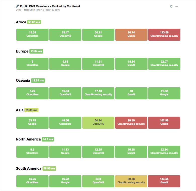
The DNS performance of the different managed service providers varies from region to region, and the color grid readily surfaces this. If you notice, the resolution times in North America and Europe are much lower than in Africa and Asia due to different ISP infrastructures in these regions and their varying performance.
If you haven’t already taken a look at our Global DNS Performance Report, please click here to get an overview and download the report.
Automate, sit back and relax
Have you ever had to wake up in the middle of the night to respond to an alert, and manually delegate it to your sister team in APAC? With Snapshots and Instant Tests via the API, you can create workflows to automatically capture a snapshot of your test, or perhaps even fire an instant test to send to the engineer on duty prompting them to resolve the issue on your behalf. You can get further information on the specific API endpoints in the developer's documentation here.
Start with the big picture. Drill down for details
Last quarter, we scaled and improved our path visualizations to help you focus on the most relevant information through effective grouping and filtering of nodes. This quarter, we have extended the same concept to our BGP Route Visualizations as well. Our BGP Route Visualizations have moved away from their previous hub-and-spoke structure to an elegant linear structure to help you better understand the relationships between different Autonomous Systems.

The green circle on the right represents the prefix of your target node, the ovals in the middle represent the different AS in the routing path to the different diamonds on the left which represent the BGP monitors. The overall structure is pretty similar in nature to how the path visualization is organized.
The monitors are paginated and sorted by the metrics you’ve selected. Want to know which monitors constitute a path change? You can easily see these monitors highlighted on page 1, and you can flip between the different pages to navigate through the data. You can also group the different monitors by a specific network and also apply filters on them based on different route characteristics. Check out our most recent blog post on visualizing and monitoring your BGP routes.
Interested in product updates like this? Subscribe to our blog and you’ll always stay connected with product updates, outage analysis posts, and other Network Intelligence and monitoring content. We would also love to get your feedback on what features you would like to see in the product. Reach out to your sales team or send us a note using the ‘Product Wish’ capability in the app.
